Buttons & Links
All buttons and links will match the color of their section (Blue or Orange).
Buttons are styled as border buttons which become filled-in on hover. The only exclusion is Action buttons which remain filled-in by default. You can select a single or dual button module. *Bolded text indicates saved module name.
For Paragraph Hyperlinks: You can select the Paragraph Module based on the color of the section to ensure that the links will use the correct color. By default, the links will be Blue, to change them to Orange you will need to add the class orangeLinks to the Text Module.
Paragraph: Orange Links
Paragraph: Orange Links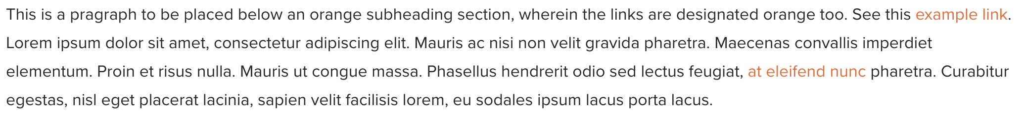
For Links with Arrow: These are only used in Colored Blocks, Event Blocks or Contact Blocks. In which case they may be either Blue, Orange, or Gray.
Link: Blue
Link: Orange
Link: Gray